Redesign of the website and app of Chitai-Gorod
In 8 months, we helped Chitai-Gorod redesign their website and app
How it all began
In March 2025, the Chitai-Gorod team approached us and invited us to participate in a tender for the redesign of their website and app. The internal design team at Chitai-Gorod was small, and they needed to update quickly across all fronts: both the website and the mobile app. Additionally, fresh solutions were required, and one of the key metrics they wanted to improve was user retention.
Chitai-Gorod is the largest bookstore chain in Russia. The audience is engaged: people notice changes in design and comment on them. Chitai-Gorod had just updated its offline branding, and one of its flagship stores had undergone a complete redesign. Previously, these were neutral supermarkets with books and stationery, but now they are a meeting place with warm lighting, cozy corners, and spaces for meetings with authors.
With such initial information and a new brand book in hand, we set to work on developing the concept 🤓
The main support became the new slogan of Chitai-Gorod: "A Meeting Place with Books"
We wanted to continue the theme of coziness and literary escapism, so we maintained several motifs:
Let the book always come first: not just an ordinary product on a marketplace, but an invitation to an exciting world.
We create a cozy space where products invite you to pick them up, touch them, and examine them.
Solutions should be flexible and suitable for supporting a large, branched team of products at Chitai-Gorod.
We utilize all the work done on offline design: we take the best and adapt what does not consider the specifics of the website and app.
Two concepts
We had about a month to prepare. Usually, we present the client with one concept that we are confident in and proceed based on their feedback. This time, the designers developed two such different directions that we wanted to explore and showcase both. Therefore, we created two independent concepts, each carefully thought out and with its own character.
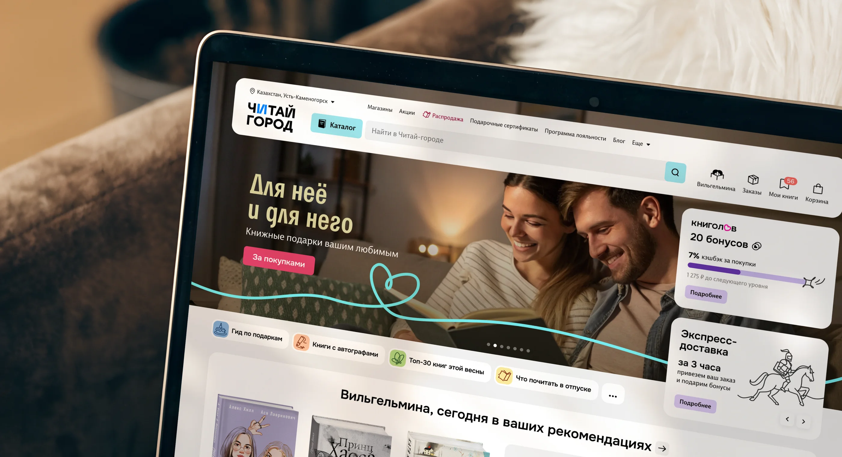
The first concept turned out to be more handcrafted and slightly vintage, with a complex grid and quotes from books directly in the product feed. The second one is also lively and crafted, but with a clear modular structure, where the main character is a book, and in the corners, illustrated characters are settled, reading their favorite story.
After several internal iterations, we became so attached to our ideas that we sent the concepts firmly convinced: our version is the most suitable. And we were not mistaken.
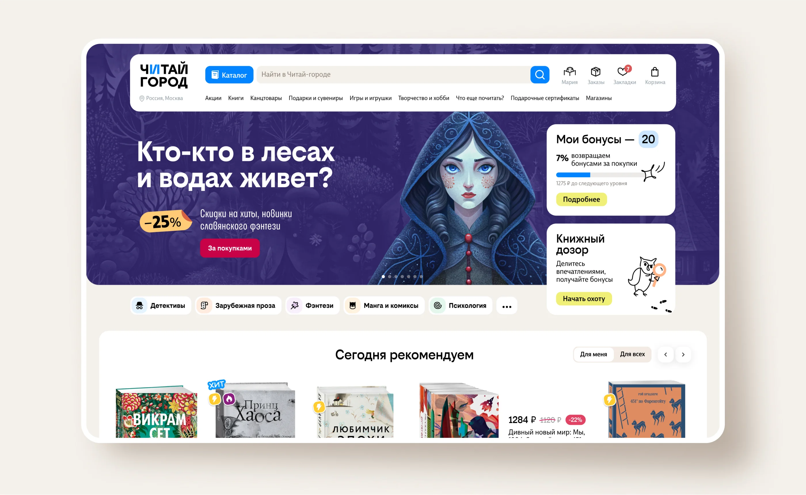
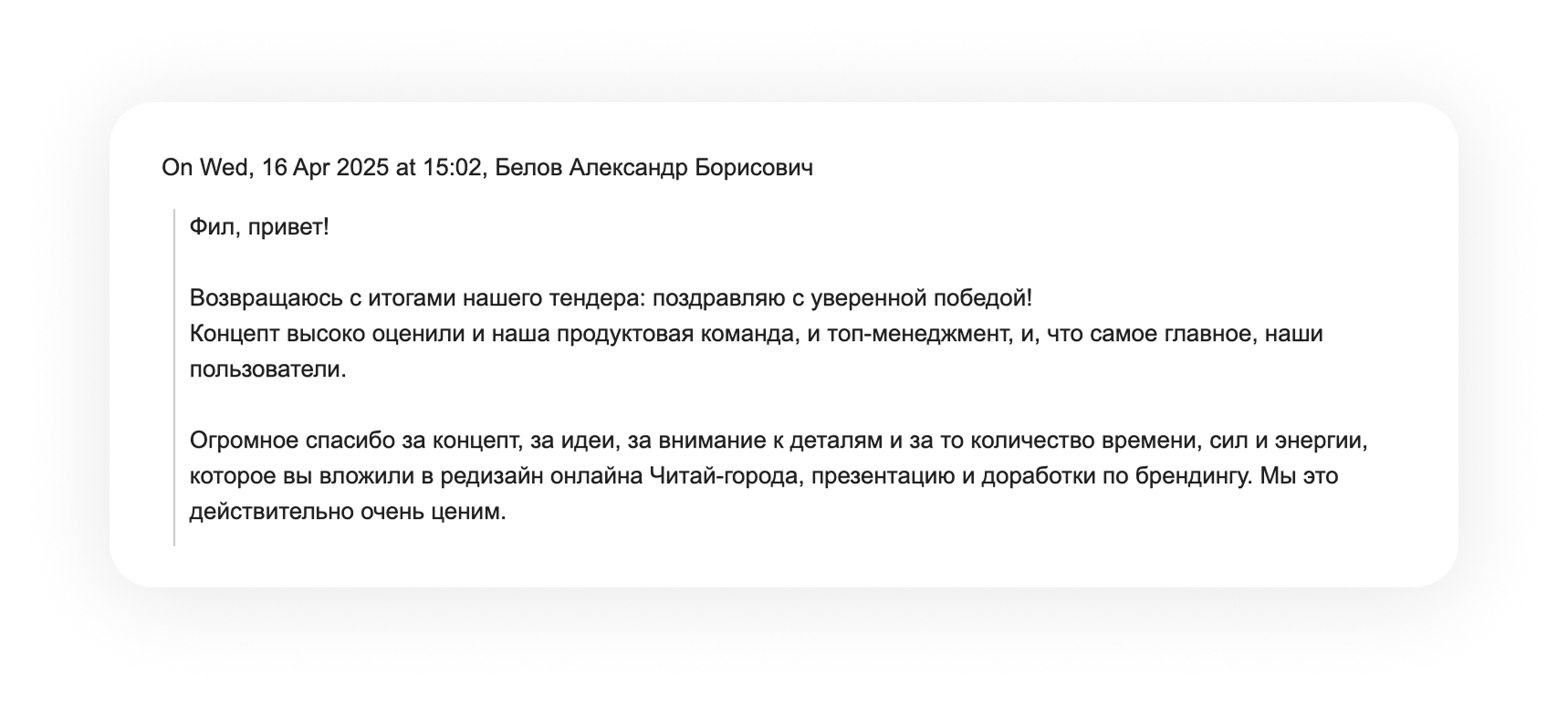
After some time, the long-awaited letter arrived, the screenshot of which instantly spread across the Motki work chats. The second concept, modular with the book as the main character, won. The product team, top management, and, most importantly, the users highly appreciated the concept.

We won the tender, what's next?
Our concept became the foundation for the new design, and work began on grounding the new ideas into the actual website and app.
After discussing the details with the Chitai-Gorod team, the entire process of the "creeping" redesign was divided into several stages:


Our approach

We hand over the layouts to developers, refining them based on feedback if necessary.
Process
Chitai-Gorod consists of several practically independent development teams: one supports the website, while another focuses on the mobile application. Each team has its own design system, developed over years of work and tailored to its processes. We rolled out the new design across both systems, often in parallel, closely collaborating with developers.
Chitai-Gorod is attentive to its audience: we frequently left several options specifically for A/B testing, and contentious decisions were always tested before launch.
Result
8.5 months · 5 designers + art director · 3 platforms (desktop, mobile web, mobile app) · 2 design systems · ~80 combinations of product mini-cards · hundreds of components and screens
The new design works on the website and in the app. Some pages have been implemented, while others are in development, and the homepage has been updated for some users. The update was gradual, without abrupt switches, and audience reactions confirmed that the direction chosen was correct.
Chitai-Gorod now looks and feels like a bookstore. Book covers have taken center stage, and the interface has become warmer and closer to the atmosphere of updated offline stores. This was the main goal.
Thank you
 To the client's team for their trust
We openly and equally discussed all problems and solutions, and this helped us achieve the desired results at every stage.
To our partners
We thank our friends from the company "FANS.Development." Guys, working in the same team with you is a pure pleasure; we are ready to go through fire and water with you!
Team
Fedor Borshchev,
Samat Galimov
technical directors
Nikolai Kiryayanov backend developer
Anastasia Sharkova project manager
Ivan Sedov
frontend developer
Vyacheslav Nabatchekov
tech lead and backend developer
Phil Smirnov
art director
Maria Yekimova
UI designer
Natalia Bulanova
UX designer
Elizaveta Plakhotnaya
project designer
More projects
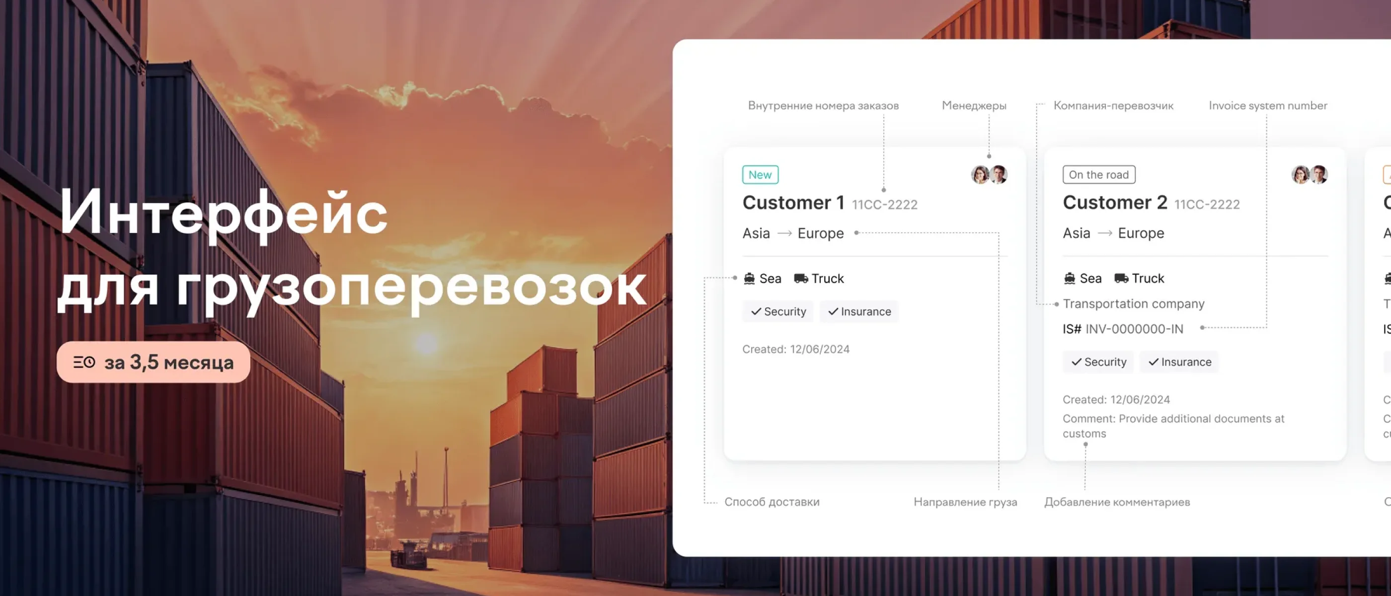
Logistic SaaS Designing a clear, scalable interface for cargo management

DeepGeo Branding and UI design for a SaaS platform helping geologists collect and analyze field data
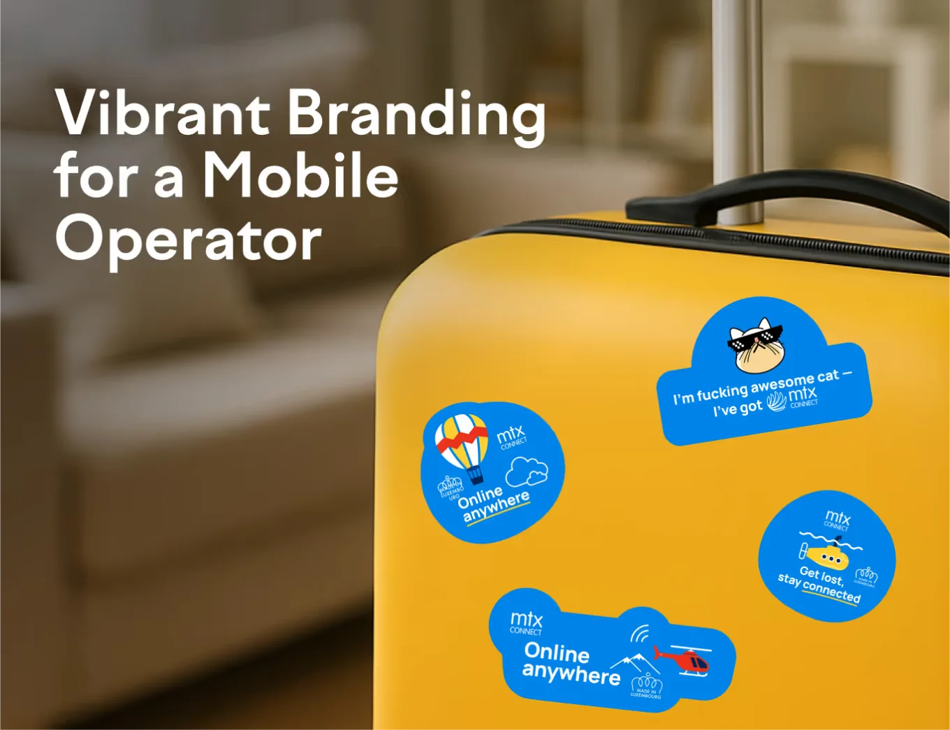
MTX Connect Rebranding MTX Connect with a fresh identity that resonates with global travelers
SCAN Branded characters and illustrations significantly boosted both conversion rates and brand awareness
Your submission has been received!

